Brand Identity • Logo Design
Avion Brand Identity
Avion Solutions initially approached the project as a logo refresh, but early discovery revealed the company was entering a major growth phase, including an acquisition that would expand its capabilities. With over 30 years of brand equity to respect, the goal became developing a modernized brand identity that could support the company’s next chapter while maintaining the recognition and trust it had built.
YEAR
CLIENT
SERVICES
2024
Avion Solutions
Brand Identity Strategy & Design

Business card template for Avion employees.

The outdoor sign for Avion with new branding.

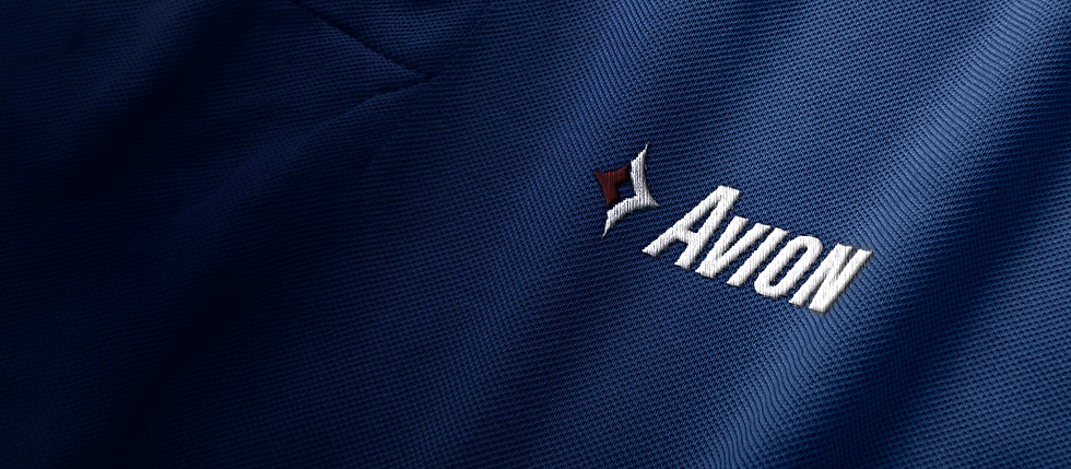
The embroidery stitched on polos for employees with Avion's new mark.
Business card template for Avion employees.
CHALLENGE
The existing logo presented several functional and strategic challenges. It lacked scalability, contained unnecessary visual elements, and relied on dated typography that limited its effectiveness across modern digital and print applications. The challenge was to simplify and modernize the identity while preserving the brand equity the company had built over three decades.
SOLUTION
Working closely with Avion’s marketing team and leadership, the identity was refined through strategic simplification. Typography was modernized and the iconography streamlined to remove outdated elements while preserving recognizable brand cues.
The project expanded beyond the logo to include a complete brand system with updated collateral applications, logo variations, and brand guidelines to ensure consistent implementation across platforms.
RESULTS
The refreshed identity positioned Avion for its next phase of growth with a modern, scalable brand system. By balancing legacy recognition with a cleaner and more flexible design language, the new identity provides a cohesive foundation to support the company’s continued expansion.